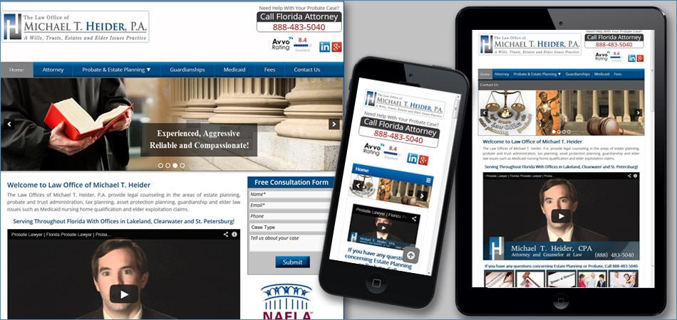
What are Mobile Responsive Websites?
Mobile Responsive web design is a design approach aimed at designing sites capable of providing an optimal viewing experience—easy reading and navigation with a minimum of re-sizing, panning, and scrolling—across a wide range of devices including smartphones, tablets etc.
The construction of a mobile responsive website is such that it allows the content, structure and image to remain the same irrespective of the device on which it is being viewed. So you do not need to have different website for various devices. If you have a responsive website, you get a full view of the site, irrespective of the device or platform it is viewed on. On smaller screens for e.g. smartphone or tablets, the website retracts to fit the smaller screen.
Before the Website Upgrade:
After studying website analytic reports, we found out that about 40% of the web traffic on www.heiderlaw.com was from smartphone & tablet users. From the analytic reports, it was clear that the smartphone users either quit the website prematurely or did not spend enough time on the website due to a tough browsing experience.
The New Mobile Responsive Website…
In Jun 2014, Pat’s Marketing rolled out the new mobile responsive website for Heider Law. The newly launched website will allow present and prospective clients of Heider Law to view and use the website even from their smartphones or any other handheld device they may be using.
Encouraged with the initial response to the website, Abhi Patel, CEO of Pat’s Marketing says, “Responsive websites are the need of the hour. Any company that is sensitive towards customers’ needs and is looking forward to increasing the conversion rates from its site must go for responsive website.” With on-the-go and multi-device browsing on the rise, it becomes crucial to design your website for an optimal browsing experience across multiple platforms.
Results: Before & After Analytic Reports
The Before & After website analytic reports had significant differences in average time on site, average number of pages per session and bounce rates. The new website significantly increased the average time on site and average number of pages per session and reduced the bounce rates which means the overall site engagement improved as a result of the website upgrade and responsive design.
- View Before Analytics Report – For Old Website – Download
- View After Analytics Report – After the New Website was launched – Download
Words from the Client:
Michael T. Heider, Attorney at Heider Law says, “I am happy I chose Pat’s Marketing to help me get my website up to date with the latest technology. Pat’s strengths are their technical knowledge and their ability to get results. If they say they are going to do something, you can count on them to do it. They looked at the big picture of what I was trying to accomplish and came up with solutions I haven’t thought of.” You can view the Video Testimonial from Mr. Heider
About Pat’s Marketing
Pat’s Marketing can help you come up with a device independent responsive website. At Pat’s Marketing, Our Toronto Website Designers can help you to design a new website or upgrade your existing website. Contact us at 1.888.488.7287 for a free consultation for your website.
